4. General Design — DataGrid (Table)
In this step, all visual and functional settings of the DataGrid widget are configured: column visibility, order, width, header style, row style, grid lines, stacked headers, pagination, scrollbars, sorting, filtering, column management, and conditional formatting.
Wizard route: /cartography/add/generaldesign
Prerequisite
Steps 1, 2, and 3 of the DataGrid flow must be completed.
1. Screen Layout
The left side contains the configuration form (column list, header/row/grid settings); the right side shows a live table preview.
2. Column Headers
| Field | Description | Unit |
|---|---|---|
| Header Background Color | Header row background color | color |
| Header Text Color | Header text color | color |
| Header Font Size | Header font size | px |
| Header Height | Header row height | px |
| Bold Font | Whether the header is bold | toggle |
| Header Hover Color | Color when hovering over a header cell | color |
Field Details — Column Headers
Column Headers Info Configures the appearance of column header cells — background color, text color, font size, font weight, and text alignment. Headers appear at the top of each column and display the column name.
Header Background — Background color of the column header row. Header Text Color — Color of the text labels shown in column headers. Font Size & Bold — Sets header text size in pixels and enables or disables bold. Hover Color — Background color applied to a header cell when the user hovers over it.
3. Row & Cell Style
| Field | Description | Unit |
|---|---|---|
| Row Background Color | Row background color | color |
| Row Text Color | Row text color | color |
| Alternating Row Color | Different color for odd/even rows (zebra) | color |
| Selection Color | Selected row color | color |
| Cell Font Size | Cell font size | px |
| Cell Padding Horizontal | Cell horizontal padding | px |
| Row Hover Color | Background color when hovering over a row | color |
| Row Hover Text Color | Hover text color | color |
| Row Hover Font Size | Hover font size | px |
Field Details — Row & Cell Style
Row & Cell Style Info Controls the visual style of data rows and individual cells — row background color, alternate row color, cell text color, font size, and text alignment. Alternating row colors improve readability in large tables.
Row Background — Default background color for all data rows. Alternating Row — Background color for every second row; zebra-stripe effect. Row Text Color — Text color used in all data cells. Font Size & Padding — Sets cell text size in pixels and horizontal cell padding. Row Hover Style — Applies distinct background color and text size when the user hovers over a data row.
Alternating Row Color
Light grey (#F9FAFB) and white alternating rows improve readability in long lists.
4. Grid Lines
| Field | Description |
|---|---|
| Grid Line Color | Line color |
| Grid Line Width | Line thickness (px) |
| Show Vertical Grid Lines | Vertical lines |
| Show Horizontal Grid Lines | Horizontal lines |
Field Details — Grid Lines
Grid Lines & Borders Info Configures the grid line visibility and style for horizontal and vertical dividers between cells. You can set grid line color and thickness to control how much visual structure the table shows.
Grid Line Visibility — Choose which lines to draw: both rows and columns, only horizontal, only vertical, or none. Grid Line Color — Color of the lines that divide rows and columns in the grid. Grid Line Width — Thickness in pixels of the grid divider lines.
5. Column Configuration
The most important section for DataGrid. All columns from Compass are listed; settings are available per column.
| Field | Description |
|---|---|
| Column Visibility | Show / hide each column (toggle) |
| Column Order | Reorder via drag-and-drop |
| Column Width | Fixed pixel or flexible width |
| Sortable | Sort rows when clicking the header (toggle) |
| Filterable | Filter box in the column header (toggle) |
Field Details — Column Configuration
Column Configuration Info Maps query result columns to grid columns and lets you set per-column properties such as label, width, alignment, number format, and conditional color rules for individual cells.
Column Order Define the default column order and per-column title and width by dragging rows in this list.

Which Columns to Show?
If the query returns many columns, select the ones you want visible here and hide the unnecessary ones. Table width and readability improve. Recommendation: keep at most 8-10 columns visible on screen.
6. Stacked Headers
Multi-level column headers spanning across multiple columns. Use to group related columns under a shared parent label.
| Field | Description |
|---|---|
| Header Rows | Add and configure multi-level column header groups |
| Header Group Style | Background color, text color, font size, and bold weight for all grouped header cells |
Field Details — Stacked Headers
Stacked Headers Info Adds multi-level column headers that span across multiple columns. Use stacked headers to group related columns under a shared parent label, providing a clearer hierarchical structure.
Header Rows Add and configure multi-level column header groups. Each row defines one tier of grouped headers spanning selected columns.
Header Group Style Sets the background color, text color, font size, and bold weight for all stacked (grouped) header cells.
Stacked Header Example
To group Machine 1 and Machine 2 columns under a Production Data header, define a stacked header spanning both columns.
7. Paging & Scrollbars
| Field | Description |
|---|---|
| Enable Paging | Split data into pages |
| Rows Per Page | Number of rows per page (10/20/50/100) |
| Pager Height | Height of the pagination bar in pixels |
| Visible Page Buttons | Number of page number buttons shown in the pager |
| Pager Position | Top or bottom |
| Horizontal Scrollbar | Always visible / shown only when content overflows |
| Vertical Scrollbar | Always visible / shown only when content overflows |
Field Details — Paging & Scrollbars
Paging & Scrollbars Info Controls data pagination (rows per page) and scrollbar visibility. Pagination limits how many rows are loaded at once, improving performance for large datasets. Scrollbars allow navigation when the table content exceeds the widget bounds.
Enable Paging — Splits data into pages and shows a pager control. Useful for large datasets. Pager Configuration — Sets rows per page, pager height, number of visible page buttons, and pager position (top or bottom). Scrollbars — Controls whether horizontal and vertical scrollbars are always visible or shown only when content overflows.
Pagination vs Scroll
Use pagination for 100+ rows; scroll is sufficient for <100 rows. For very dense (>500) data, pagination protects performance.
Refresh and Pagination
When the refresh interval fires, the table resets to the first page. Set Refresh Interval ≥ 30 s to avoid disrupting users who are reviewing data.
8. Sorting & Filtering
| Field | Description |
|---|---|
| Sorting | Click column header to sort rows ascending/descending |
| Multi-Column Sort | Sort by multiple columns simultaneously |
| Sort Icon Color | Color of the sort icon |
| Filtering | Show a filter icon in column headers |
Field Details — Sorting & Filtering
Sorting & Filtering Info Enables interactive column sorting (click column header to sort ascending/descending) and filter row (a text input row below the header for filtering rows by column value in real time).
Sorting — Enables column header tap to sort rows. You can also allow multi-column sort and customize the sort icon color. Filtering — Shows a filter icon in column headers that lets users filter rows by column values.
Filtering in Alarm Tables
If you make the machine_name column filterable in an alarm table, operators can instantly filter alarms for a specific machine in real time.
9. Column Management
| Field | Description |
|---|---|
| Column Reorder | Users can drag column headers to rearrange column order at runtime |
| Column Resize | Users can resize columns by dragging the border between headers |
Field Details — Column Management
Column Reorder — Allows users to drag column headers to rearrange column order at runtime. Column Resize — Enables resizing columns by dragging the border between column headers.
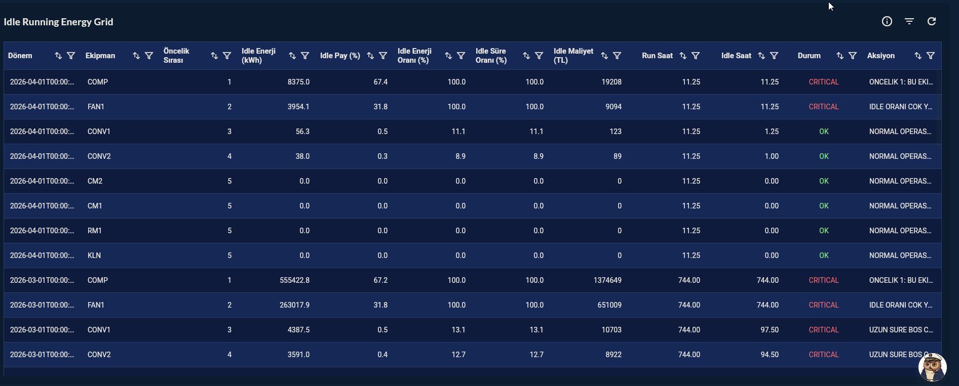
10. Conditional Formatting
Applies background or text color to specific cells or rows when a column's value meets a defined condition.
| Field | Description |
|---|---|
| Rule Column | Data column whose value is evaluated |
| Comparison Operator | ==, !=, >, <, >=, <=, contains, is empty, not empty |
| Threshold Value | Value to compare against |
| Style Application | Apply to full row or only the matched cell |
| Background Color | Background color applied when the condition is met |
| Text Color | Text color applied when the condition is met |
Field Details — Conditional Formatting
Conditional Formatting Applies background or text color to specific cells or rows when a column's value meets a defined condition. Multiple conditions per column are supported, evaluated in order.
Each rule contains: - Rule Definition: Select a data column, a comparison operator (==, !=, >, <, >=, <=, contains, is empty, not empty) and a threshold value. When the column value satisfies the condition, the style below is applied. - Style Application: Choose whether the style applies to the full row or only the matched cell. You can enable a background color and/or a text color override independently. Both are optional — enable only what you need.
Conditional Color in Alarm Lists
In an alarm table, based on the priority column:
- HIGH → 🔴 red
- MEDIUM → 🟡 yellow
- LOW → ⚪ white
11. Confirmation
When you click the Next button at the top right, flow.hasGeneralDesign = true is marked.