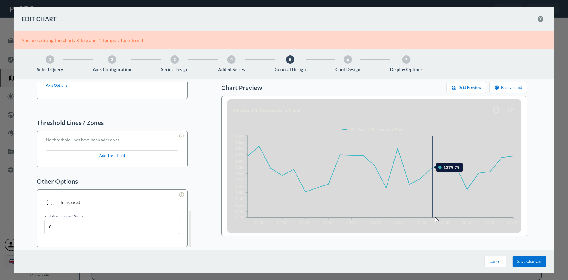
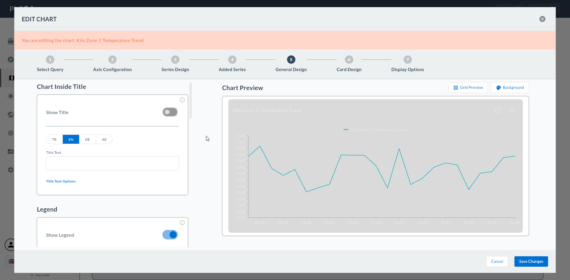
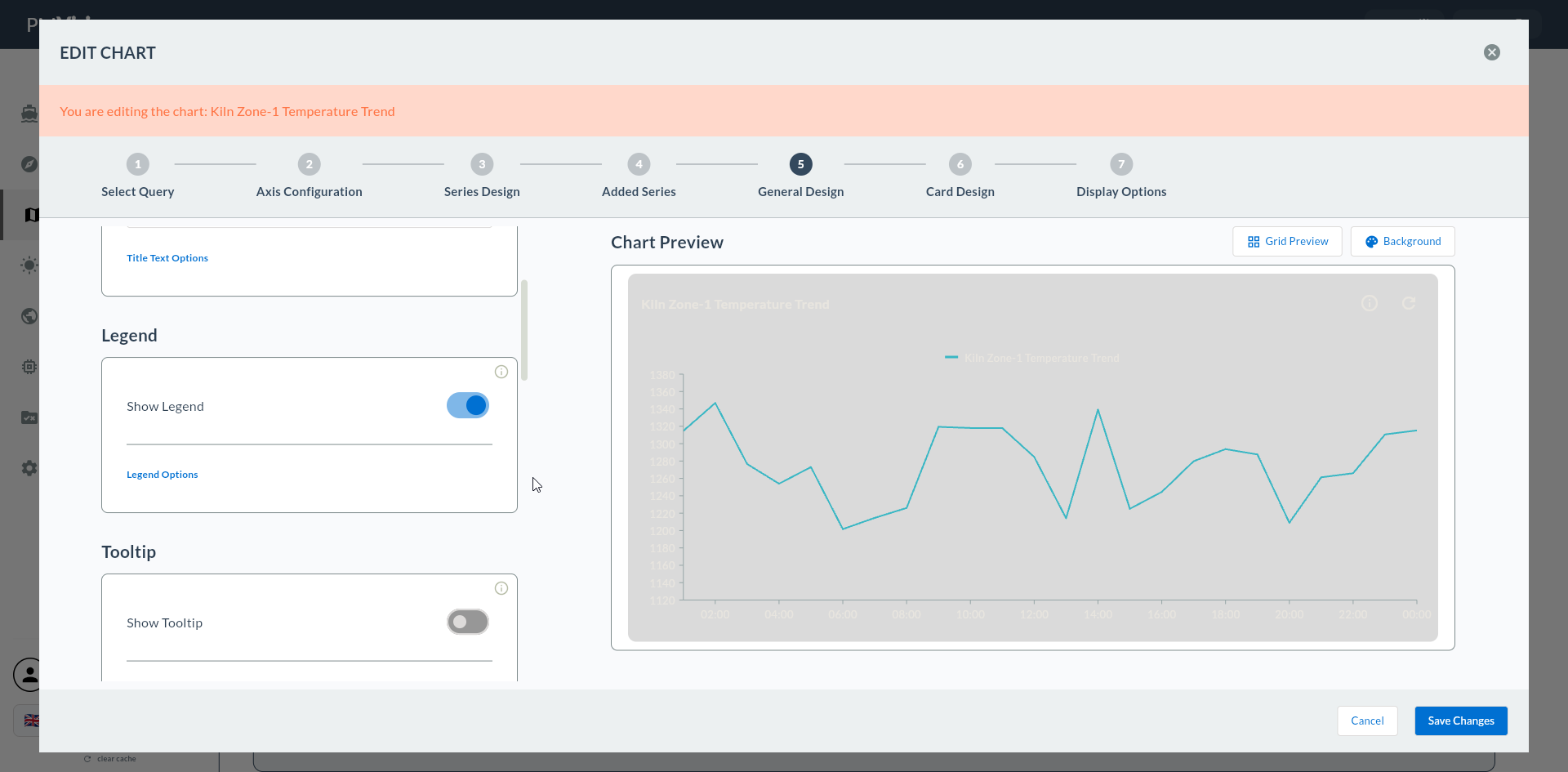
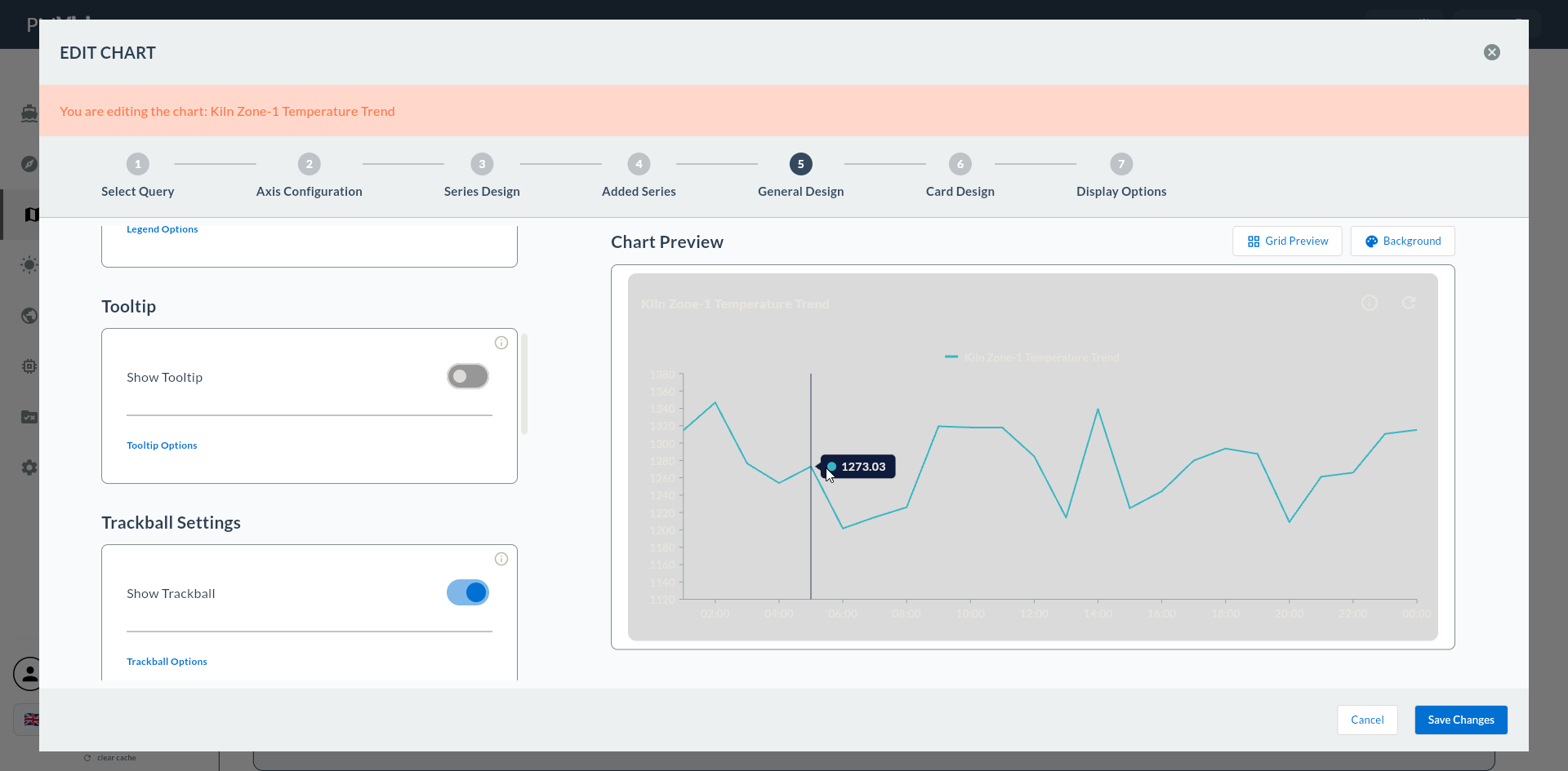
5. Series Design — Standard Cartesian
In this step the visual settings of the widget's first data series are configured: series name, color, data labels, markers, and chart-type-specific settings (Column Settings for Column/Bar).
On the left is the series design form, on the right is the live chart preview. Your changes are reflected in the preview instantly.
Wizard route: /cartography/add/seriesdesign
Back Button Behavior
If you go back from this step with Back, the configured first series is deleted. You must re-enter the form values.
1. Screen Layout
2. Series Display
| Field | Description | Type |
|---|---|---|
| Series Name | Series name to appear in legend | text |
| Series Color | Line / fill color | color |
Meaningful Series Name
In the legend, use names like Line-3 Temperature, Line-4 Temperature instead of series_1, series_2. When you switch to multi-series (Step 6), you can quickly identify which series belongs to which machine.
3. Data Label Settings
| Field | Description | Unit |
|---|---|---|
| Show Data Labels | Value label on top of each data point | toggle |
| Data Label Text Color | Label text color | color |
| Data Label Font Size | Label font size | px |
| Data Label Position | Label position (top, middle, bottom, outside, etc.) | enum |
Disable Data Labels at 200+ Points
In multi-point Line/Area charts, labels overlap. For dense time series, disable Data Labels; spotlight values with the tooltip.
4. Column Settings (Column and Bar only)
If you selected Column Series and Bar Series, the additional fields below appear. This section is not present for Line/Area/Spline/Step Line.
| Field | Description | Unit |
|---|---|---|
| Column Width | Bar width | px |
| Column Spacing | Spacing between two bars | px |
Shift-Based Column
If there are 3 bars (S1/S2/S3) on a shift-based category axis, keep Column Width in the 60-80 px range and Column Spacing at 10-15 px; bars are clearly separated but not too dispersed.
5. Line / Area / Spline / Step Line Additional Settings
In these chart types, Marker and Stroke settings appear instead of Column Settings:
| Field | Description | In Which Type |
|---|---|---|
| Marker Visibility | Show data points with a symbol | Line / Area / Spline |
| Marker Shape | Circle / Square / Diamond / Triangle | Line / Area / Spline |
| Stroke Width | Line thickness (px) | Line / Spline / Step Line |
| Animation | Loading animation | All Cartesian |
Spline Smoothing
The smoothness (tension) of the line in Spline gives good results with the default value; in rare cases, the interpolation is changed on the backend side. The Tension field is not provided in this version of the UI.
6. If the Preview Appears Frozen
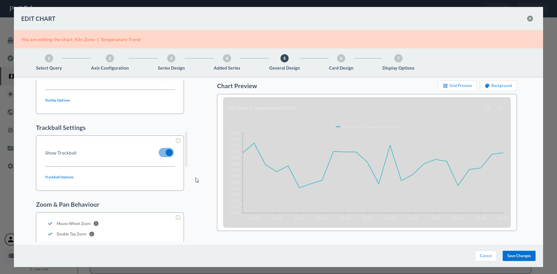
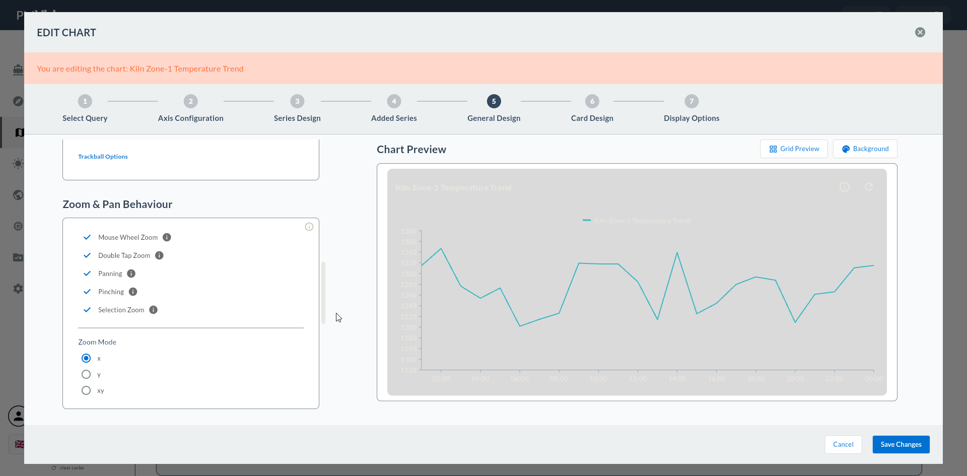
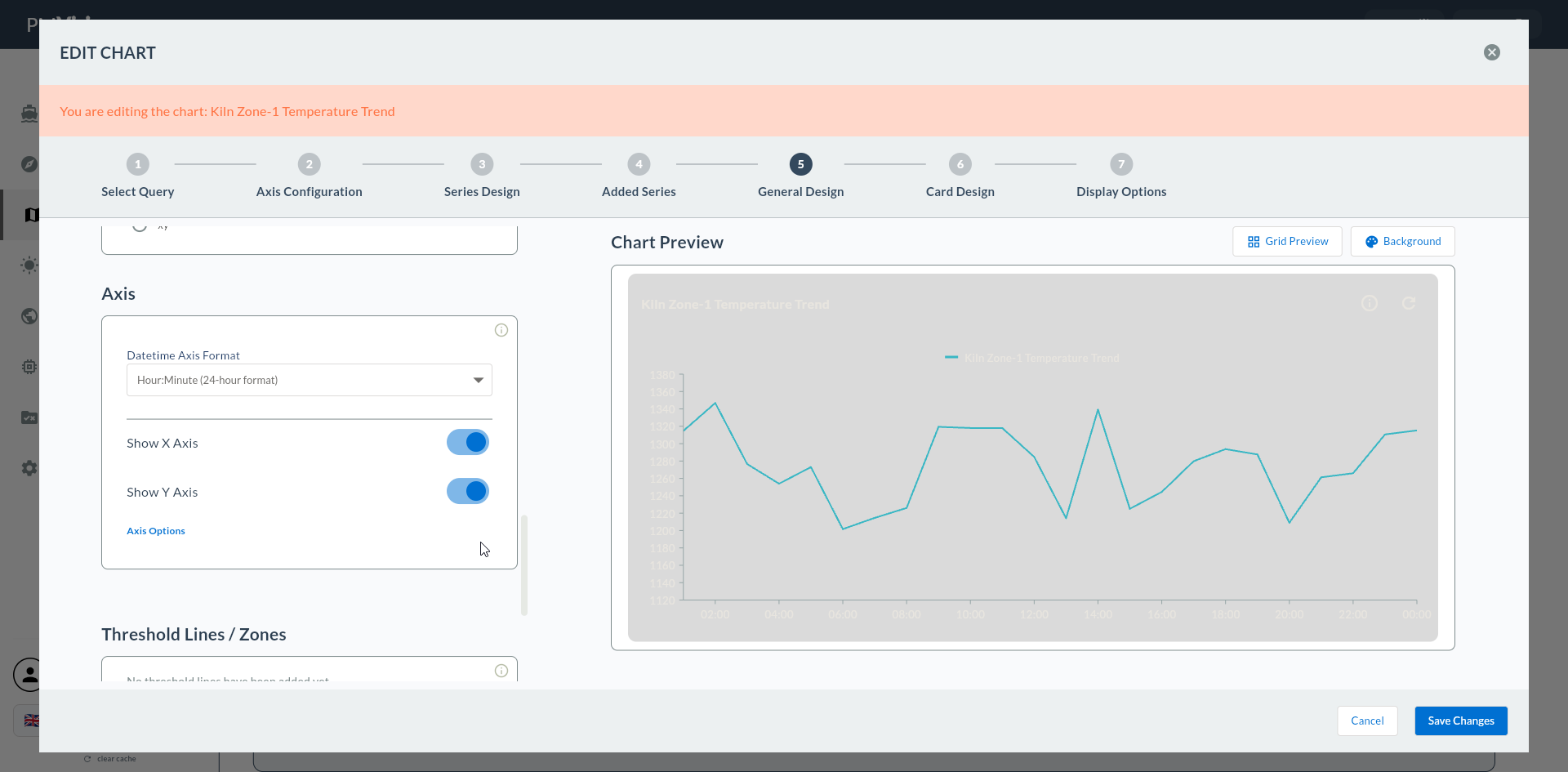
If the preview panel does not refresh, click on a field in the form again to trigger a focus change. This is the refresh trigger of Cartography's reactive build mechanism.
7. Confirmation
When you click the Next button at the top right, flow.hasSeriesDesign = true is marked and you proceed to the 6. Add Series screen.