Stacked Column Series
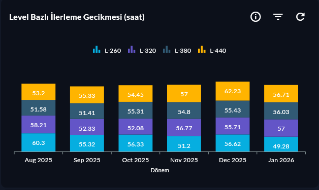
Stacked Column Series shows categories as vertical stacked bars. Each bar consists of layers of multiple components; used to read both the total and the contribution of components at the same time.
Prerequisite
This chart type can only be selected in step 2 of the Cartography Widget Wizard. If you have not started widget creation, start the wizard first; an appropriate Compass record is also required.
When to Use
| Scenario | Why Stacked Column? |
|---|---|
| Production by shift (A/B/C shift) | Total + shift contribution at a glance |
| Downtime type distribution by line | Each category's share visible |
| Product family + period comparison | Total difference is prominent in stacked bars |
Data Structure
| Column | Type | Example |
|---|---|---|
| X column | TEXT / DATE |
day, line |
| Y column | NUMERIC |
production_count |
| Stack By column | TEXT |
shift, downtime_type |
-- Example: per-shift production by line
SELECT line_name, shift, SUM(production_count) AS total
FROM production_log
WHERE DATE(ts) = CURRENT_DATE
GROUP BY line_name, shift
ORDER BY line_name, shift;
Step 4 — Axis Config
Type shift into the Stack By Column field. The system automatically creates a layer for each unique shift value.
Stacked Column vs Stacked Column 100
| Situation | Stacked Column | Stacked Column 100 |
|---|---|---|
| Total value matters | ✓ | ✗ |
| Only share percent matters | — | ✓ |
| Absolute + ratio together | ✓ Visible | — |
9-Step Summary — For Stacked Column Series
Stacked Column Series uses the Stacked Cartesian flow.
| # | Step | Key point for Stacked Column | Detail |
|---|---|---|---|
| 1 | Group Selection | Cartesian | → |
| 2 | Chart Type | Stacked Column Series card | → |
| 3 | Compass Record | X + Y + Stack By columns | → |
| 4 | Axis Config + Stack By | X: CategoryAxis, Y: Numeric, Stack By Column | → |
| 5 | Series Design | Column Width, Spacing, Color palette | → |
| 6 | (skipped) | — | — |
| 7 | General Design | Legend, Y Axis Suffix (absolute unit) | → |
| 8 | Card Design | Refresh: 300-600s | → |
| 9 | Display | Name, Tags, Folder | → |
→ Stacked Cartesian Flow overview