2. Chart Type Selection — Range Column
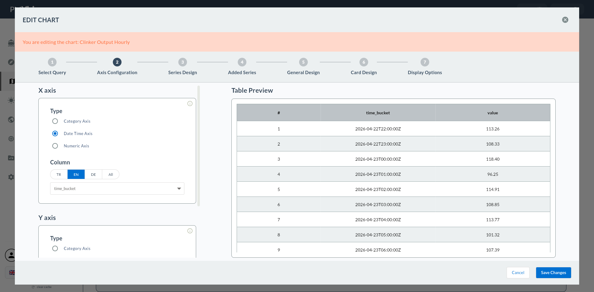
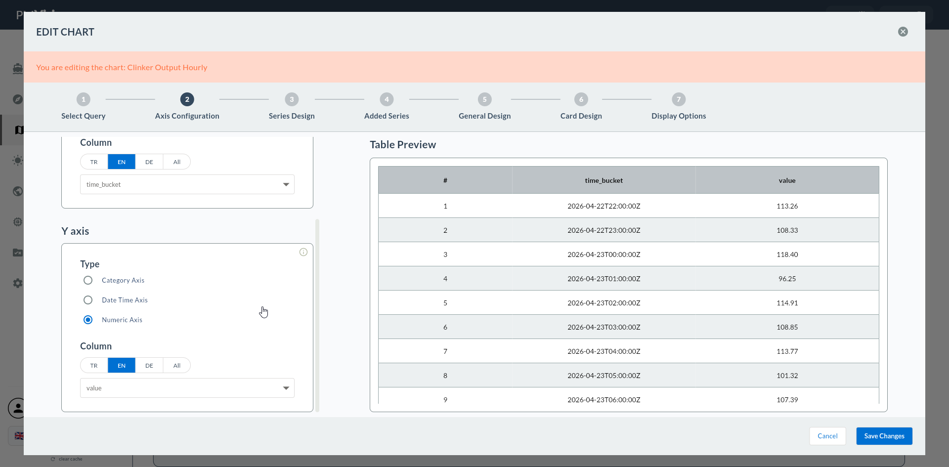
In the second step, you select Range Column Series from the 15 chart types in the Cartesian group. This selection triggers the display of Low Value Column, High Value Column, and optional Color By Column fields instead of a single Y axis column in Step 4, and causes Steps 5/6 to be skipped.
Wizard route: /cartography/add/selectchart
1. Review the Type List
The 15 chart types of the Cartesian group are listed in the left column. The Range Column card is generally found among the other Column variants.
2. Range Column Series
| Feature | Description |
|---|---|
| Primary use | Min-max range bar (temperature band, low/high financial data, tolerance range) |
| Y axis | Bound to Low + High pair instead of a single value |
| Color By | Optional categorical column for different color per bar |
| Multiple series | Not supported (Steps 5 and 6 are skipped) |
Range Column vs Stacked
Range Column shows two points (low/high) as a range — it is not a component breakdown stack. Use the Stacked type for component totals.
Multiple Series
Range Column works with a single series. To show two separate ranges, create two separate widgets.
3. Confirm the Type
Click the Range Column card. The card is highlighted with a bold green border.
Click the Next button at the top right.
Proceeding Without Selecting a Type
If no type is selected, Next gives a warning: "Please select a chart type first".
Types in the Wrong Flow
For Cartesian types other than Range Column, use separate flows:
- Standard Cartesian (Line/Area/Spline/Column/Bar/Step Line) → Standard Flow
- Stacked* types → Stacked Flow
- Waterfall → Waterfall Flow