7. General Design — Dynamic Text
In this step, the Dynamic Text widget gains its visual personality: format string, text color, alignment, icon, and wave animation. The format string formats the value using the {value} placeholder.
Wizard route: /cartography/add/generaldesign
Prerequisite
Steps 1, 2, 3, and 4 of the Dynamic Text flow must be completed (5, 6 are skipped).
1. Screen Layout
The left side contains the configuration form; the right side shows a live card preview.
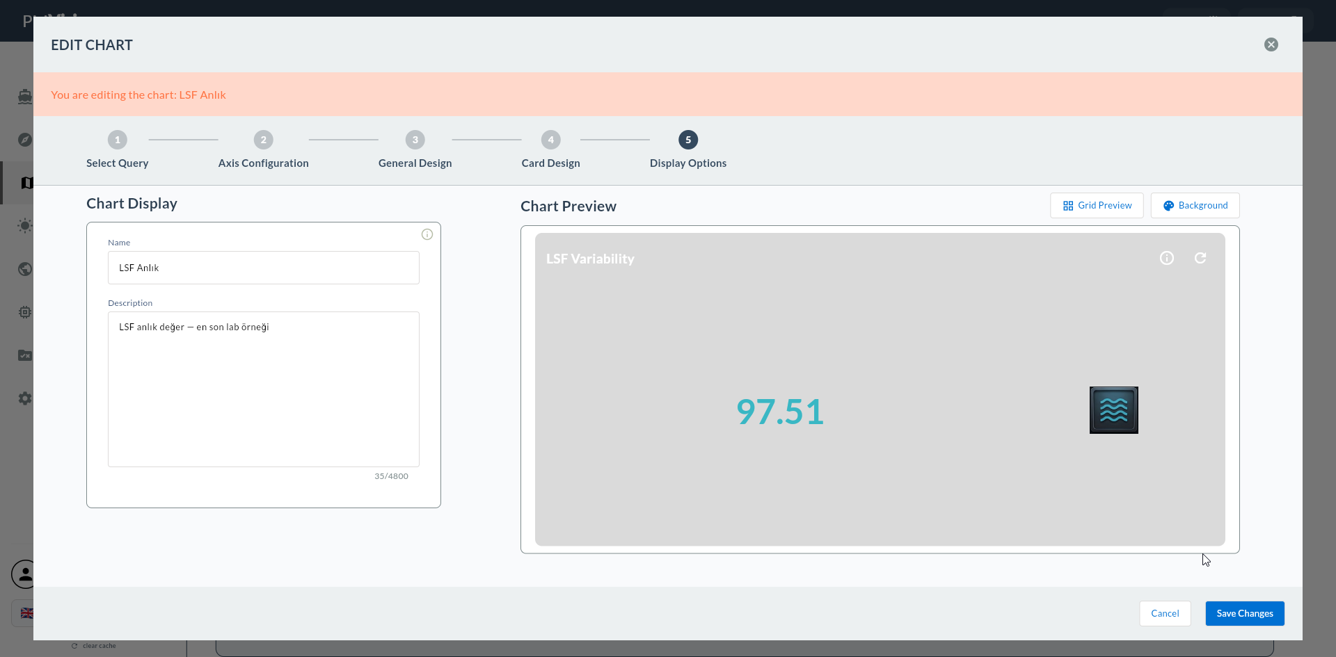
2. Text Settings
| Field | Description |
|---|---|
| Text Content | Template — the {value} placeholder can be used |
| Default Text Color | Text color |
| Text Position | Left / Center / Right alignment |
| Font Size | General text size (px) |
{value} Placeholder
The value from the Compass record is written in place of the {value} placeholder. For example, if Text Content = Today's Production: {value} and the value is 1245, the card shows Today's Production: 1245.
3. Format
Format string for numeric values. There are 5 preset options beyond Default:
| Format | Description | Example |
|---|---|---|
| Default | No format applied | 1245 |
| With Percent | Appends % after the number |
92.5% |
| With Dollar | Adds $ prefix |
$1,245.50 |
| With Euro | Adds € prefix |
€1,245.50 |
| With TL | Adds ₺ prefix or TL suffix |
1.245,50 ₺ |
| With Pound | Adds £ prefix |
£1,245.50 |
Format Selection Guide
| Scenario | Format |
|---|---|
| OEE, fill percentage | With Percent |
| Turkish lira revenue | With TL |
| USD export | With Dollar |
| EUR export | With Euro |
| Count, tally | Default |
4. Icon and Wave
Decorative icon and wave animation in the card header area.
| Field | Description |
|---|---|
| Show Icon and Wave | Icon and wave visibility (toggle) |
| Default Wave Color | Wave color |
| Select Icon | Selection from preset icon list |
| Upload Image | Upload a custom image |
| Icon/Image Size | Icon size (px) |
| Default Icon Color | Icon color |
Dynamic Text Icon Matching
- OEE: 📊 chart icon
- Production count: 🏭 factory icon
- Revenue: 💰 money icon
- Temperature: 🌡️ thermometer icon
5. Confirmation
When you click the Next button at the top right, flow.hasGeneralDesign = true is marked.