7. General Design — Standard Cartesian
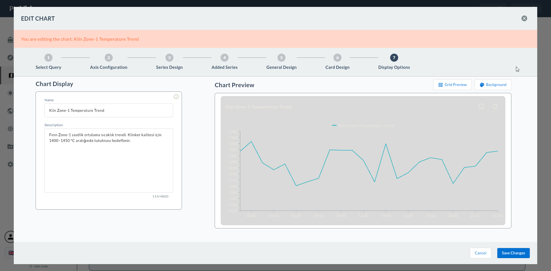
In this step, the widget's chart-level visual settings are configured: title, legend, tooltip, X/Y axis titles and labels, plot area, zoom behavior, trackball.
On the left is the configuration form, on the right is the live chart preview.
Wizard route: /cartography/add/generaldesign
1. Screen Layout
2. Chart Title
Title above the chart of the widget.
| Field | Description |
|---|---|
| Show Title | Title visibility (toggle) |
| Title Text | Title text |
| Title Color | Title text color |
| Title Font Size | Title font size (px) |
| Title Font Weight | Normal / Bold / SemiBold |
| Title Background Color | Title background color |
| Title Border Color | Title border color |
| Title Border Width | Border thickness (px) |
| Title Alignment | Left / Center / Right |
Card Title vs Chart Title
The Title in this step is the title above the chart (e.g., "Line-3 Temperature Trend"). The card title at the top of the card is a separate field in 8. Card Design.
3. Legend
Legend for multiple series.
| Field | Description | Possible Values |
|---|---|---|
| Show Legend | Legend visibility | toggle |
| Legend Position | Position | top / bottom / left / right |
| Legend Text Color | Text color | color |
| Legend Font Size | Font size | px |
| Legend Font Weight | Normal / Bold | enum |
| Legend Overflow Mode | Overflow behavior | wrap / scroll |
Disable Legend for Single Series
On a single-series Line chart the legend takes up space. Enlarge the chart area with Show Legend = Off.
4. Tooltip
Detail box visible on hover.
| Field | Description |
|---|---|
| Show Tooltip | Tooltip visibility (toggle) |
| Tooltip Background Color | Background color |
| Tooltip Border Color | Border color |
| Tooltip Border Width | Border thickness (px) |
| Tooltip Text Alignment | Text alignment |
| Tooltip Text Color | Text color |
| Tooltip Font Size | Font size (px) |
| Tooltip Font Weight | Normal / Bold |
5. X Axis (Axis Labels)
| Field | Description | Unit |
|---|---|---|
| X Axis Name | Axis title (e.g., "Hour", "Shift") | text |
| X Axis Title Font Size | Axis title font size | px |
| X Axis Label Font Size | Axis tick label font size | px |
| X Axis Interval | Tick interval (auto if blank) | number |
| X Axis Minimum | Minimum value to display | number / date |
| X Axis Maximum | Maximum value to display | number / date |
DateTimeAxis Interval
If you selected DateTimeAxis, leave Interval blank; the chart automatically sets 1 hour / 1 day according to the number of points. If you set it manually, gaps or pile-ups occur.
6. Y Axis
| Field | Description | Unit |
|---|---|---|
| Y Axis Name | Axis title (e.g., "Count", "Temperature") | text |
| Y Axis Label Suffix | Unit appended next to numbers (°C, bar, %) |
text |
| Y Axis Title Font Size | Axis title font size | px |
| Y Axis Label Font Size | Tick label font size | px |
| Y Axis Interval | Tick interval | number |
| Y Axis Minimum | Minimum value to display | number |
| Y Axis Maximum | Maximum value to display | number |
Y Axis Label Suffix
Use Y Axis Label Suffix to add a unit next to the numbers on the Y axis. E.g., 100 °C, 45 bar, 92 %. Do not confuse this suffix with the Y Axis Column name in any step — this is purely a visual suffix.
Y Axis Min/Max Pinning
Pin Min=0, Max=100 for metrics in the 0-100 range like OEE. Otherwise, if values are in 80-90 range, the axis automatically starts from 80 and looks unbalanced.
7. Plot Area
The drawing region of the chart.
| Field | Description | Unit |
|---|---|---|
| Plot Area Border Width | Drawing area border thickness | px |
| Plot Area Background Color | Drawing area background color | color |
8. Zoom
For multi-series and long time series.
| Field | Description |
|---|---|
| Pinch Zoom | Zoom with touchpad pinch (toggle) |
| Pan Mode | X / Y / XY pan |
| Zoom Mode | X / Y / XY zoom |
Pan Mode
When an hourly time series is shown for 24+ hours, choose Pan Mode = X; the user can drag the X axis.
9. Trackball
Crosshair cursor for multi-series intersection.
| Field | Description | Unit |
|---|---|---|
| Trackball Line Width | Trackball line thickness | px |
| Trackball Tooltip Font Size | Trackball tooltip font size | px |
Trackball Saves Lives in Multi-Series
On a Line chart with 3+ series, when trackball is enabled, all series' values at the same X are listed in a single tooltip on hover.
10. Confirmation
When you click the Next button at the top right, flow.hasGeneralDesign = true is marked.