Column Series
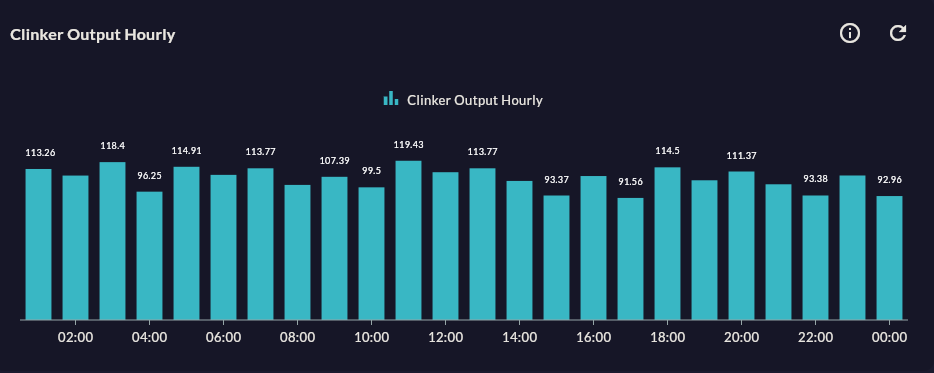
Column Series compares values across categories with vertical bars. The standard choice for daily/weekly production, shift performance, or machine-by-machine comparison.
Prerequisite
This chart type can only be selected in step 2 of the Cartography Widget Wizard. If you have not started widget creation, start the wizard first; an appropriate Compass record is also required.
When to Use
| Scenario | Why Column? |
|---|---|
| Daily production count (last 30 days) | Categorical, independent values |
| OEE comparison by line | Side-by-side visual comparison |
| Scrap quantity by shift | Categorical — time independent |
| Monthly energy consumption | Each month is an independent value |
Column or Line?
If data points represent independent categories (line name, shift), choose Column; if they represent a continuous process (hours, minutes), choose Line.
Data Structure
| Column | Type | Example |
|---|---|---|
| X column | TEXT / DATE |
shift_name, date |
| Y column | NUMERIC |
production_count, oee_percent |
-- Example: today's production by line
SELECT line_name, SUM(production_count) AS total
FROM production_log
WHERE DATE(ts) = CURRENT_DATE
GROUP BY line_name
ORDER BY line_name;
Wizard Configuration
Step 5 — Series Design
| Field | Description | Default |
|---|---|---|
| Series Color | Bar color | Auto palette |
| Corner Radius | Top corner roundness of the bar (px) | 0 |
| Column Width | Bar width ratio (0–1) | 0.8 |
| Data Labels | Value label above the bar | Off |
| Animation | Entry animation | On |
Step 6 — Add Series
You can show multiple metrics side-by-side for the same categories (grouped column). Secondary Y axis is optional.
Step 4 — Stack By
For a stacked view, choose the Stacked Column type; Column type has no Stack By.
Tips
- If labels are long (e.g. shift name 15 chars), rotate the X axis labels by 45° or use Bar Series.
- Negative values are supported (scrap percentage, deviation) — the bar extends downward.
9-Step Summary — Column Series
Column Series uses the Standard Cartesian flow.
| # | Step | Key point for Column | Details |
|---|---|---|---|
| 1 | Group Selection | Cartesian | → |
| 2 | Chart Type | Column Series card | → |
| 3 | Compass Record | Categorical X column (shift, line, product) | → |
| 4 | Axis Config | X: CategoryAxis, Y: Numeric | → |
| 5 | Series Design | Column Width, Column Spacing, Corner Radius | → |
| 6 | Add Series | Grouped column on same categories (side by side) | → |
| 7 | General Design | X Axis Name, Y Axis Suffix | → |
| 8 | Card Design | Refresh: 60-300s (SQL aggregate) | → |
| 9 | Display | Name, Tags, Folder | → |
→ Standard Cartesian Flow overview
Next Step
→ Bar Series — Horizontal version → Stacked Column — Stacked version → Other Cartesian Charts