Line Series
Line Series is a basic line chart used to monitor continuous changes along a time or category axis. Ideal for showing both the instantaneous variation and the overall trend in sensor readings.
Prerequisite
This chart type can only be selected in step 2 of the Cartography Widget Wizard. If you have not started widget creation, start the wizard first; an appropriate Compass record is also required.
Use Cases
| Scenario | Data Type | Why This Chart |
|---|---|---|
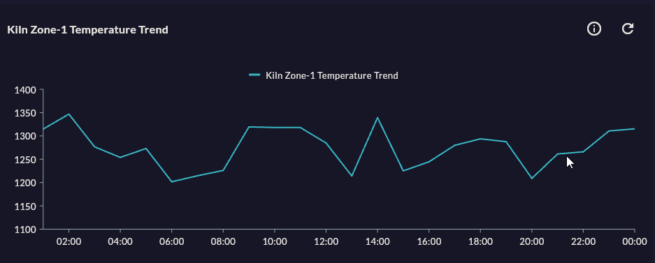
| Kiln temperature monitoring | Time series, °C | Continuous trend and anomaly detection |
| Hourly production rate | Time series, pcs/hour | Shift-wide trend view |
| Energy consumption monitoring | Time series, kWh | Comparing peak hours vs base load |
| Machine vibration data | Time series, mm/s | Showing threshold breaches in context |
| Cooling water pressure | Time series, bar | Long-term drift analysis |
Data Requirements
| Column | Type | Description | Required |
|---|---|---|---|
| X axis | datetime or string |
Timestamp or category label | Yes |
| Y axis | numeric |
Measurement value (temperature, pressure, etc.) | Yes |
| Series grouper | string |
To show multiple devices on one chart (added as a separate series in Step 6) | No |
Column names
Make Compass record column names meaningful with AS aliases (e.g. value AS temperature_c). These names appear in the dropdowns in Step 4.
Specific Configuration
After Step 4 (Data Configuration) and Step 5 (Series Design), the following Line-specific settings apply:
| Setting | Values | Description |
|---|---|---|
| Marker visibility | On / Off | Marks data points with a symbol |
| Marker shape | Circle / Square / Diamond / Triangle | Data point symbol |
| Line thickness (Stroke Width) | 1–6 px | Line visual weight |
| Animation | On / Off | Animation played when the chart first loads |
Tips
Disable markers on large datasets
If you have more than 200 data points, disable markers; otherwise the chart becomes visually cluttered and render performance drops.
Use FastLine for 5,000+ rows
If queries return more than 5,000 rows, choose the FastLine type in Step 2. FastLine does not support markers or animation but renders much faster.
Missing data (null) points
null values from sensor outages break the line. Filling these gaps with COALESCE or forward-fill in the Compass record makes the chart more readable.
Secondary Y axis
To compare two metrics with different scale units, add the second series in Step 6 as Secondary Y Axis (e.g. temperature + pressure).
9-Step Summary — Line Series
Line Series uses the Standard Cartesian flow. See the linked step pages for detailed instructions:
| # | Step | Key point for Line | Details |
|---|---|---|---|
| 1 | Group Selection | Cartesian | → |
| 2 | Chart Type | Line Series card | → |
| 3 | Compass Record | SQL/REST/MQTT/Excel — ordered X column | → |
| 4 | Axis Config | X: DateTime/Numeric, Y: Numeric | → |
| 5 | Series Design | Marker, Stroke Width, Animation | → |
| 6 | Add Series | Multiple series with secondary Y axis | → |
| 7 | General Design | Tooltip, Trackball, Y Axis Suffix | → |
| 8 | Card Design | Refresh: 30-60s (SQL), 0 (MQTT) | → |
| 9 | Display | Name, Tags, Folder | → |
→ Standard Cartesian Flow overview