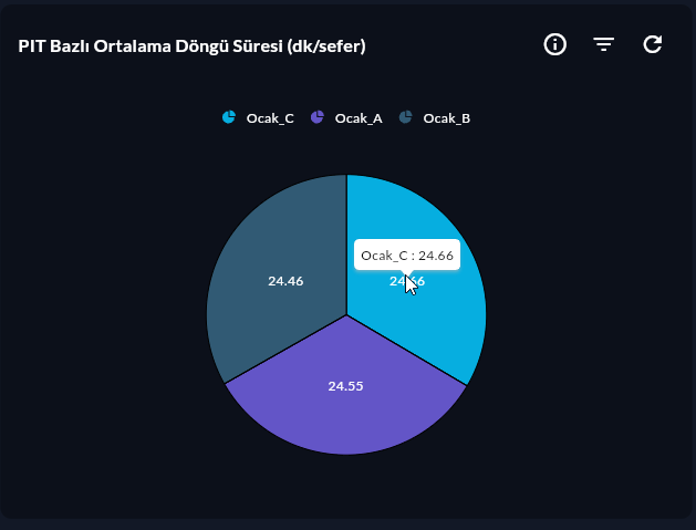
Pie Series
Pie Series shows the proportional share of categories in a total as slices. The simplest and most familiar circular chart.
Prerequisite
This chart type can only be selected in step 2 of the Cartography Widget Wizard. If you have not started widget creation, start the wizard first; an appropriate Compass record is also required.
When to Use
| Scenario | Example |
|---|---|
| Sales share by product family | Product A: 45%, B: 30%, C: 25% |
| Downtime type distribution | Failure: 40%, Maintenance: 35%, Other: 25% |
| Energy source mix | Electricity: 60%, Natural gas: 40% |
When Not to Use
With more than 6 categories slices become small and unreadable. For many categories, Bar Series or Stacked Column 100 may be more suitable.
Data Structure
| Column | Type | Description |
|---|---|---|
| X (label) column | TEXT |
Slice name (product_family, downtime_type) |
| Y (value) column | NUMERIC |
Slice size (absolute or percent) |
-- Example: downtime type distribution
SELECT downtime_type, COUNT(*) AS count
FROM downtime_log
WHERE DATE(ts) = CURRENT_DATE
GROUP BY downtime_type
ORDER BY count DESC;
Wizard Configuration
Step 4 — Axis Config
| Field | Value |
|---|---|
| X Axis Column | downtime_type (label) |
| Y Axis Column | count (value) |
Step 5 — Series Design (Pie-specific)
| Field | Description | Default |
|---|---|---|
| Explode | Pull the selected slice outward | Off |
| Explode Index | Which slice is exploded (starts at 0) | 0 |
| Explode Offset | Explode distance | 0.1 |
| Label Visibility | Inside / Outside / Hidden | Outside |
| Label Content | Value / Percent / Name + Percent | Percent |
| Start Angle | Start angle of the first slice (°) | 0 |
Tips
- Highlight the largest slice by exploding it.
- Group categories
< 2%as "Other" at query level for very small slices. - To add text/value to the center, use Doughnut Series.
9-Step Summary — For Pie Series
Pie Series uses the Circular flow (Step 6 is skipped — single series).
| # | Step | Key point for Pie | Detail |
|---|---|---|---|
| 1 | Group Selection | Circular | → |
| 2 | Chart Type | Pie Series card | → |
| 3 | Compass Record | Label + value (3–6 slices ideal) | → |
| 4 | Axis Config | X: CategoryAxis (label), Y: Numeric (value) | → |
| 5 | Series Design | Explode, Start/End Angle, Stroke | → |
| 6 | (skipped — single series) | — | — |
| 7 | General Design | Legend (required), Data Label = Percent | → |
| 8 | Card Design | Refresh: 60-300s | → |
| 9 | Display | Name, Tags, Folder | → |
Next Step
→ Doughnut Series → Radial Bar Series → Other Circular Charts